


Every Surface Counts!

Hey everyone! I’ve been a little quiet the past few Sundays, sometimes creativity needs a pause to recharge! But I’m back :) and this week’s post is one I’ve been especially excited to share. Let’s get into it.
Let’s be honest… there’s no shortage of talk about color palettes and furniture placement. But the elements that actually drive how people experience space? They're often embedded deeper: in the way a room moves, how it holds tension, where it leads the eye, and what it asks you to feel without saying a word.
Curves vs. Lines: The Emotional Geometry of Space
What makes a space feel inviting versus intimidating? One of the most fundamental answers lies in shape. Environmental psychology and neuroscience consistently show that curved, organic forms are perceived as more pleasant and safe, while straight edges and sharp corners suggest order and strength but can also feel rigid or even threatening.
One brain-imaging study revealed that participants rated rooms with rounded walls and furnishings as more “beautiful and pleasant” than those with rectilinear forms. Curves, quite literally, activated emotion and reward centres in the brain. Angular spaces? They sparked the brain’s threat-detection response.
This isn’t just academic theory! It’s a guiding principle embedded in the legacy of legendary architects. Oscar Niemeyer, master of the sinuous form, once wrote:
“I am not attracted to straight angles or the straight line… What attracts me is the free and sensual curve, the curve that I find in the mountains… in the body of the beloved woman.”
Antoni Gaudí took it further, declaring, “There are no straight lines or sharp corners in nature. Therefore, buildings must have no straight lines or sharp corners.” The resulting forms from Niemeyer’s flowing towers to Gaudí’s otherworldly façades feel alive, expressive, and emotionally rich.
Yet we shouldn’t vilify straight lines. In the right context, they convey strength, clarity, and structure. Institutional and commercial spaces often rely on rectilinear layouts to project stability. But as neuroscientist Moshe Bar found that too much angularity can activate our stress responses. That’s why thoughtful design balances geometry with grace, a sweeping curve here, a round window there softens and humanises the space.
Pro Tip: In residential or hospitality design, offset rigid gridlines with arched doorways, spiral staircases, or circular motifs to calm and anchor the user.


Rhythm and Repetition: Composing Harmony Through Design
Visual rhythm is a fundamental design principle in architecture and interiors! Great design is musical…it moves! Visual rhythm is what leads the eye, unifies space, and makes interiors feel intentional rather than chaotic.
Kengo Kuma beautifully captured this idea:
“Rhythm is like music… it’s all about composition. Architecture should touch all the senses. Rhythm, repetition, light, shadow… define the desired atmosphere.”
Think of rhythmic design as choreography for the eye. Repeating architectural elements such as columns, beams, archways establish a visual pulse. Repetition in textures, colors, or patterns subtly anchors a space, guiding people without their conscious awareness. In other words, carefully repeating shapes, colors or textures creates a sense of flow and harmony, like a melody threading through a song.
When applied skillfully, rhythm can make a large interior feel cohesive. An even pulse of repeating columns, windows or archways can establish order; alternating patterns or progressive scaling adds interest. A space with “steady rhythm and repetition…will lead the eye around the room seamlessly.” For example, using the same accent colour in pillows, artwork and accessories around the room creates colour rhythm, while a sequence of identical pendants or floorboards introduces material rhythm. Repetition does not need to be rigid you can balance sameness with variety. For example echoing a pattern in various places around the room. Say, a polka-dot motif on both a pillow and a distant piece of art or repeating a texture (like leather or wood) in different finishes. This way, the elements feel related without looking monotonous.
These recurring elements create predictability, drawing people through a space intuitively. At the same time, rhythm can build tension or surprise: a deliberate break in the pattern (like a bold contrasting tile or an accent chair in the midst of symmetry) can draw attention and create a moment of visual interest.
Ultimately, the goal is balance: a rhythmic sequence that’s too literal may feel dull, while too little repetition can seem chaotic. When done well, rhythm in interiors subtly communicates unity and movement. It links different areas and details so the room reads as a coherent whole, much as a refrain anchors a poem.


The Ceiling as the Fifth Wall: Elevating Spaces from the Top Down
If you’ve ever looked up in a room and found...nothing, you’ve encountered a missed opportunity. The ceiling is the room’s largest untouched surface, and when treated right, it can completely transform atmosphere.
Designer Debbie Mathews calls the ceiling “a blank slate with so many design options available to add… another layer.” Jennifer Williamson adds, “Far from being just a blank surface, the ceiling can add depth, drama or even a touch of whimsy.”
So, how do you turn this often-ignored surface into a design asset? Start with dimension. Architectural detailing like coffers, mouldings, beams, or paneling doesn’t just decorate the ceiling but sculpts it. Think of coffered grids as a kind of spatial rhythm that adds depth and formality. Exposed beams, whether rustic reclaimed timber or sleek stained oak draws the eye upward and add character that feels rooted and architectural. Even the simple touch of repeated wood slats or crown molding can add visual cadence overhead.
Designer Kevin Kaminski sums it up well: “Think wood paneling, beams, trays or coffers” features that literally carve architecture into the ceiling. These elements can make a low ceiling feel taller or add tactile richness to a cavernous room that might otherwise feel sterile.
Then there’s colour and surface treatment which is the fastest way to turn “ceiling” into “statement.” Deep, moody paints like charcoal or navy can make a space feel intimate, cozy, even cinematic. High-gloss lacquer or metallic finishes bounce light and add unexpected glamour, think of it as jewelry for the ceiling. Want to go all in? Try wallpaper, a mural, or even a hand-painted fresco. Suddenly, the ceiling isn’t just overhead but overhead art.
And let’s not forget lighting, the ultimate ceiling wingman. Hidden LED strips, perimeter uplighting, or dramatic chandeliers aren’t just functional; they become part of the architecture. Proper lighting can enhance texture, define geometry, and make even a flat drywall ceiling feel layered and alive.
Four Ceiling Moves That add Design Value:
Beamed or Coffered Ceilings: Create depth, drama, and rhythm. Bonus: they can absorb sound and disguise mechanicals. A simple square coffer grid, for instance, can lend classical gravitas without overwhelming a space.
Bold Paint or Pattern: A painted ceiling is a designer’s secret weapon. Dark tones cozy a space; light colors lift it. Patterned tiles or ceiling stencils inject personality and pull the eye up.
Molding and Trim: From ornate plaster rosettes to clean-lined contemporary grids, molding frames the ceiling and adds a sense of intention. Tin tiles or decorative panels can echo historical styles or inject modern flair.
Lighting Effects: Recessed LEDs, pendant groupings, and even sculptural fixtures transform the ceiling into a glowing visual statement. Light becomes architecture when you let it play across varied textures.
But here’s the catch: scale and context matter. In grand foyers, dining rooms, and living areas, a bold ceiling treatment can become the star. But in tight quarters or rooms with low ceilings, heavy coffers or beams might feel oppressive. In those cases, subtle treatments like a matte color shift or delicate trim can still make the ceiling feel thoughtful without overplaying it.
And the benefits go beyond aesthetics. Thoughtfully designed ceilings can conceal ductwork, soften acoustics, and even balance proportions in oddly shaped spaces. But most of all, they complete the room.


Staircases: From Circulation to Centerpiece
The humble staircase is having a moment and rightly so. No longer just functional, the best staircases today are sculptural centerpieces, commanding attention and defining the personality of a space.
Design firm Uber puts it plainly: “More than just a functional feature, a staircase can become a dramatic focal point that enhances the overall aesthetic of a home.”
Notable examples include:
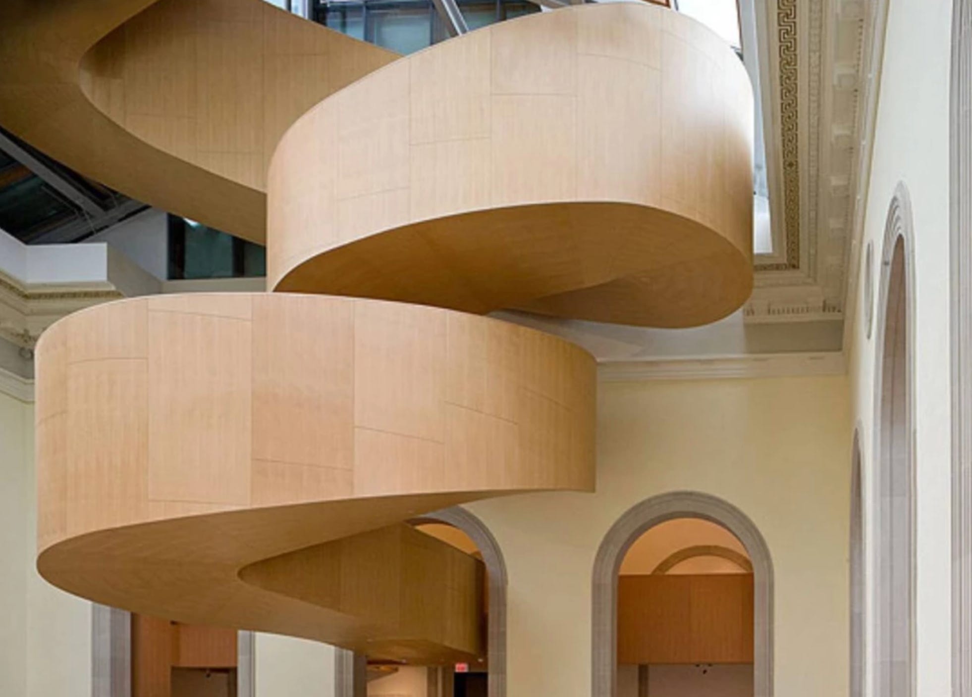
Frank Gehry’s redesign of Toronto’s Art Gallery of Ontario includes a dramatic floating stair of laminated Douglas fir stretching up multiple levels.
Zaha Hadid’s MAXXI museum in Rome was built around sweeping steel stair towers that feel like moving sculptures.


Norman Foster’s City Hall (London) contains a coiled glass-and-steel stair winding up through the atrium. In each case, the stair itself is an expressive form: not concealed, but proudly on display.


Elements of a Statement Staircase:
Form: Spirals and helical shapes feel fluid and organic. Bold zig-zags or folded planes look ultra-contemporary. These shapes naturally draw the eye upward.
Construction: Open risers, cantilevers, or floating treads add lightness and intrigue. They appear to defy gravity.
Materials: Polished wood, stone, glass, metal! Each material tells its own story. Custom railings often become the most distinctive feature of the entire room.
Lighting: Integrated lighting under treads, along handrails, or spotlighted from above adds drama. At night, these elements turn the stair into a glowing sculpture.
Placement: Central positioning in a foyer or atrium lets the stair become the space-defining anchor.
Pro Tip: In commercial or hospitality spaces, a grand stair can serve as both a circulation point and an Instagram-worthy focal moment!
If there’s one truth that threads through every detail—whether it’s a curve, a coffered ceiling, a rhythmic material pattern, or a showstopping staircase—it’s this: design is never passive. Every choice we make sends a message. Every form we shape becomes part of a silent dialogue with the people who inhabit the space.
We like to think of lines and curves as aesthetic decisions. But they’re more than that. They're behavioral cues. Emotional triggers. Memory-makers.
The challenge and the art is in being deliberate. Because in the end, every space speaks, even when you don’t mean for it to. The question is:
What is yours saying?