As architects and interior designers, we’re trained to focus on what goes into a space things like furniture arrangements, lighting schemes, tactile textures, and eye-catching finishes. But here’s the paradox: some of the most impactful design choices are found not in what we add, but in what we leave out. A term called negative space, also known as white space (the quiet hero of great interior design.)
Negative space refers to the unoccupied areas around and between objects. These are not accidental voids; they are intentional pauses in the visual narrative of a room. Far from being empty or lacking, these spaces are rich with purpose. They guide the eye, shape how we move, and even influence how we feel. In fact, mastering negative space is essential for creating interiors that breathe! both visually and emotionally.
At its core, negative space is the breathing room of design. It’s the clean expanse behind a sculpture that helps it command attention. It’s the open stretch between a sofa and a coffee table that invites natural movement. It’s the simplicity of a blank wall that lets a singular painting sing.
As Homes & Gardens wisely puts it, negative space “allows a room to breathe.” Without it, interiors can feel chaotic and overcrowded. Too much of it, and you risk a space that feels cold or incomplete. The challenge and the artistry is finding that perfect balance.
Why Negative Space Deserves Your Attention
1. It Creates Visual Hierarchy
Negative space is your secret weapon for drawing attention where you want it. By reducing visual clutter, it elevates key pieces. A sculptural chair against a bare wall becomes a statement. A single pendant light suspended over an uncluttered table becomes a moment of design poetry. Just as in a gallery, where white walls frame the art, interiors need space to let elements shine.
2. It Enhances Function and Flow
In both homes and public environments, empty space facilitates movement and functionality. It’s the clear path between furniture that makes a room feel navigable, the buffer zone that transforms a crowded lobby into a tranquil welcome area. Negative space is what keeps circulation smooth and spatial experiences intuitive.
3. It Shapes the Emotional Atmosphere
Ever notice how spas, luxury hotels, and meditation rooms exude calm? That’s negative space doing the heavy lifting. A room free from overstimulation gives the mind and body permission to relax. The Japanese concept of “ma” the space between things teaches us that emptiness carries weight. Silence in design, much like in music, can be profoundly moving.
Now that we’ve unpacked why negative space matters, let’s talk about how to wield it with intention.
Leave Breathing Room Around Key Pieces
Resist the urge to fill every inch. Let major furniture pieces like your sofa, dining table, or bed have space to “breathe.” A blank wall above a headboard or an open stretch of floor between zones isn’t a missed opportunity; it’s a thoughtful choice. Like a frame around art, it draws focus and brings clarity.
Make the Void a Feature
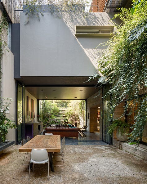
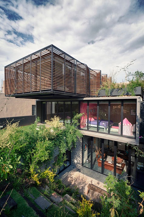
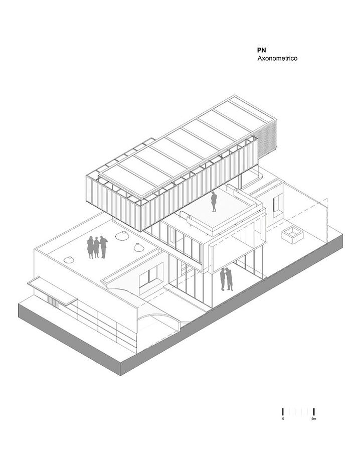
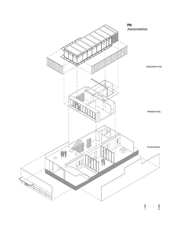
Sometimes, the absence is the design. Think of a light-filled stair void, or a double-height atrium in a small home. At PN House in Mexico, architects designed two solid volumes separated by a striking air gap transforming the void itself into a central feature. Within that emptiness lies a rooftop terrace and suspended walkway. The message? Emptiness can be architecture.

Embrace Subtractive Design
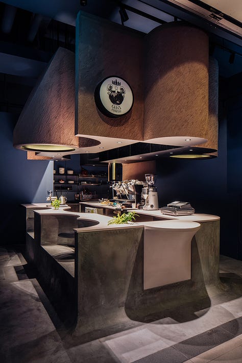
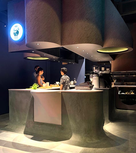
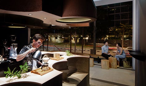
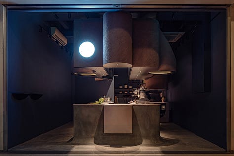
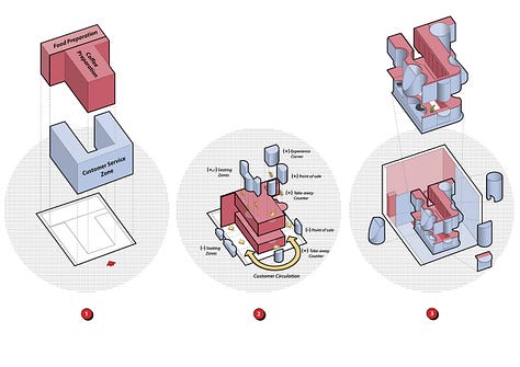
In compact spaces, negative space is often carved out rather than left behind. Voids Café in Singapore, created by Studio SKLIM, showcases this beautifully. In just 28 m², they sculpted seating, counters, and shelves into a solid block, subtracting instead of adding. The result is a space that feels fluid, organic, and smartly restrained.

Let Light Animate the Emptiness
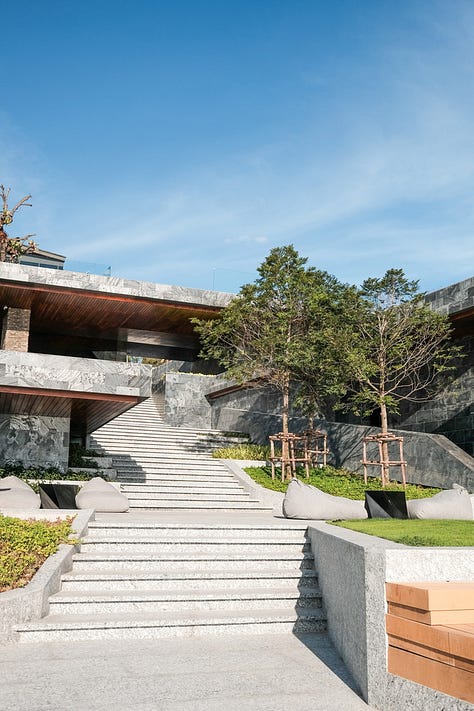
Designers like Tadao Ando and Peter Zumthor demonstrate how light gives life to empty space. A shaft of sunlight through a skylight transforms a void into a sanctuary. Shadows cast under a staircase create intrigue. At Mason Resort in Thailand, negative space beneath decks and stairs plays host to ever-changing patterns of light and shadow, enriching the spatial experience hour by hour.


Use Contrast to Highlight Emptiness
Contrast helps define the edges of your negative space. A pale wall behind a dark velvet sofa, or a light wood floor beneath a stark black chair, helps the “empty” areas pop. This is particularly effective in minimalist designs, where contrast replaces visual clutter.
Minimize Accessories with Intention
One impactful piece can say more than ten. A sculptural vase, a bold painting, or a distinctive light fixture becomes a focal point when given space around it. As minimalist designer John Pawson notes, “the absolute minimum” invites us to feel the room, not just see it.
Design isn’t just about addition, it’s about subtraction. What you don’t place in a room can be just as powerful as what you do. Negative space isn't empty; it's essential. It’s the pause that gives rhythm, the breath that brings balance, and the silence that allows beauty to be heard.
So the next time you're tempted to add just one more piece, consider this: maybe what your space really needs... is room to exhale.


Thanks for writing this. Brilliant and well-said. In fact, inspirational... literally. I hope you don't mind a shout out re: white space on a resume?